In my last article on listviews, I presented how it is possible to create a custom listview with items containing more than a simple line of text, without the use of external XMLs. Now I come with a new challenge:
 |
 |
 |
Yes, you can have this nice interface in your Android Project. Here is what you need to know:
1. We create a custom listview adapter as in the previous article. This will hold two String: first name and last name.
2. Based on position, we load the special graphics: the item with position 0, will be the top image. The last position item will be the bottom image. We have special images if the item before had content or if it was empty:
		//check current item in list
		boolean isEmpty = ( (item.getFirstName().length() == 0) &&
							(item.getLastName().length() == 0));


		boolean isPrevEmpty = false;
		if (prevItem == null)
			isPrevEmpty = true;
		else
			isPrevEmpty = ( (prevItem.getFirstName().length() == 0) &&
					(prevItem.getLastName().length() == 0));
To better understand how the background images for each item are combined, you have the source code included below, look for the RES folder to see the images.
3. Based on position, some of the items get special content, eg. the very first item is a Header, with an EditText and two ToggleButtons. Normally you would use these to sort the content of your list.
In CustomAdapter.java:
//header
		if (position == 0) {
Will handle the EditText and the two toggle buttons. The toggle buttons are like check boxes, but they support images. The image is defined in an xml, filter_left.xml and filter_right.xml corresponding to the left and right togglebuttons. The XML is places together with the images, and the content is as follows:
In CustomAdapter.java , the bottom item is handled as follows:
else if (position == total - 1) {
			//-- this is the LAST LV ITEM --//
This position parameter , but also the total variable, are conveniently sent from within the CustomAdapter class:
 public View getView(int position, View convertView, ViewGroup parent)
    {
    	CustomAdapterItem item = itemList.get(position);
    	CustomAdapterItem prevItem = null;
    	if (position > 0) prevItem = itemList.get(position-1);
        View v = new CustomAdapterView(this.context, item, position, itemList.size(), prevItem );
        return v;
    }
As you can see we access the previous item as well, to learn if it’s populated or not, and use the proper image for out item in the listview:
 If the previous item had content |
 If the previous item was empty |
As you can see this helps to create a continuous interface listview.
To handle the click events and text change event in the top EditText, we set the callback back to the parent class:
In CustomAdapterView:
setOnClickListener((OnClickListener) context);
setId(item.getItemID());
...
et.setId(CustomComplexListview.idFilterEdit);
et.addTextChangedListener((TextWatcher) context);
But make sure the parent class, implements the click and text change events or your app will crash:
public class CustomComplexListview extends Activity implements OnClickListener, TextWatcher {
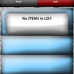
The interface is vertically scrollable – a very nice effect, including the header moves together with the rest of the items.
 |
 |
When the application first starts, the listview is scrolled automatically so that the Header is hidden. A very nice effect for an elegant listview in your application. See: CustomComplexListview.java:
m_lv.setSelection(1);
To populate the listview, I decided to process the top Header and the last bottom item separately. The reason is these are special items that do not get the normal content (first name + lastname):
m_lv = new ListView(this);

        ArrayList m_lvItems = new ArrayList();
   		//
   		//add Header
   		m_lvHeaderItem = new CustomAdapterItem("","",0); //add header
   		m_lvItems.add(m_lvHeaderItem);
   		//add items
   		CustomAdapterItem lvItem;

   		int items = 0;

   		lvItem = new CustomAdapterItem( "Radu", "Motisan", idLVFirstItem+items);
       	m_lvItems.add(lvItem);
       	items++;

       	lvItem = new CustomAdapterItem( "PocketMagic", ".net", idLVFirstItem+items);
       	m_lvItems.add(lvItem);
       	items++;

       	lvItem = new CustomAdapterItem( "Complex", "Listview", idLVFirstItem+items);
       	m_lvItems.add(lvItem);
       	items++;

	    // add extra items to fill the rest of the listview: we need 4 items at least!
	    for (int i=0;i<4-items;i++) {
	      	lvItem = new CustomAdapterItem("","", 0);
	       	m_lvItems.add(lvItem);
	    }

	    //add Footer
	    lvItem = new CustomAdapterItem("","",0); //add footer: must be last item!
   		m_lvItems.add(lvItem);
   		//create the Adapter
   		if (m_lvAdapter == null) m_lvAdapter =  new CustomAdapter(this, m_lvItems);
   		//Add adapter to Listview
   		m_lv.setAdapter((ListAdapter) m_lvAdapter);
        // Configure listview: no divider, no focusable, etc
   		m_lv.setDividerHeight(0);
   		m_lv.setScrollBarStyle(0);
   		m_lv.setSelection(1);
   		m_lv.setFocusable(false);
By default, besides the Header and the Footer (bottom big item), we always get 4 items (to fill the screen up). Also I use setDividerHeight(0) and setScrollBarStyle(0) to disable the separator line between listview items.
Inside one item, but also in the Header when we have the EditText and the two togglebuttons, we use Relative layouts to conveniently place the components, one relative to another:
//the EditText
et.setId(CustomComplexListview.idFilterEdit);
et.setBackgroundResource(R.drawable.edit);
et.addTextChangedListener((TextWatcher) context);
RelativeLayout.LayoutParams layoutparams = new RelativeLayout.LayoutParams(LayoutParams.FILL_PARENT, LayoutParams.WRAP_CONTENT);
layoutparams.leftMargin = 0;
layoutparams.topMargin = 0;
PanelH.addView(et, layoutparams);
...
//The First Toggle Button
RelativeLayout.LayoutParams layoutparams1 = new RelativeLayout.LayoutParams(LayoutParams.WRAP_CONTENT, LayoutParams.WRAP_CONTENT);
layoutparams1.addRule(RelativeLayout.BELOW, CustomComplexListview.idFilterEdit);
layoutparams1.addRule(RelativeLayout.ALIGN_PARENT_LEFT);
PanelH.addView(b1, layoutparams1);
As you can see, we simply align the left toggle button below the EditText control. Extremely convenient!
 |
 |
 |
 |
 |
 |
You'll see all the details in my code:
CustomComplexListview
If you have any questions, use the comments form below.

This app is getting failed when try to run
@Sapna, you can compile the code yourself, source code available above.
Hi ,
Nice work ,But i need listview like in first some option is there if i choose any one it will navigate to second listview page.
(ie “in first list view country,fruits option , if i choose country option navigate and show list of country “) this what i want
you can use this article as a starting point for what you need